Reduction as a signal of confidence
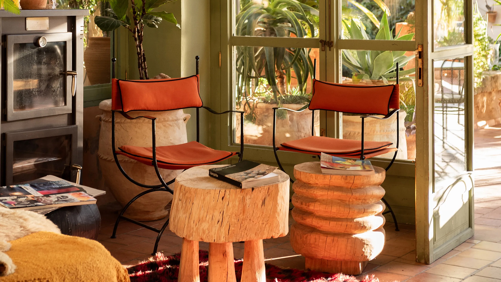
Premium hospitality brands demonstrate authority by mastering what they choose to show. Visual restraint reflects strategic clarity and composure. Singita applies this discipline across its digital presence. The website relies on large margins, a limited palette, and slow visual rhythm. Each page unfolds with intention, allowing space to breathe. Guests perceive control and confidence through this calm structure. Reduction becomes a statement of assurance, showing that the brand understands where value truly lies.
Colour as intentional hierarchy
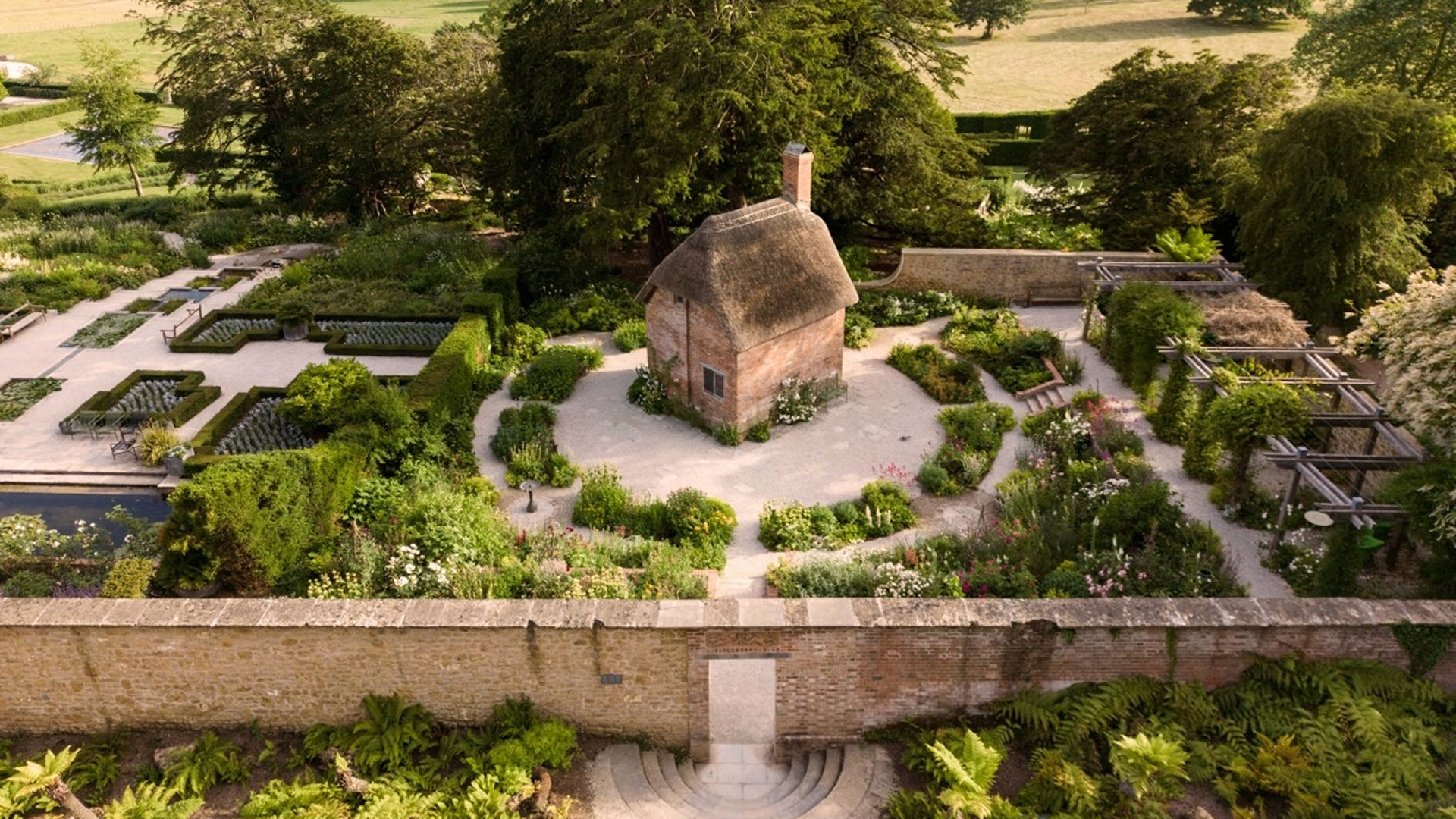
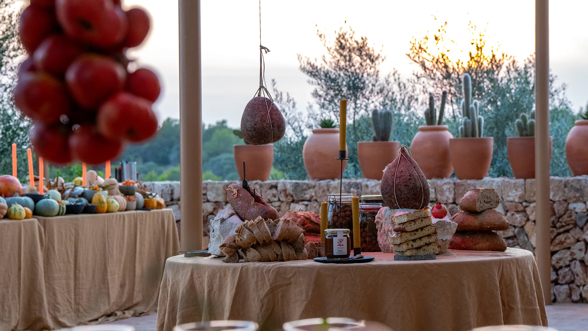
When colour appears with purpose, it structures perception. Heckfield Place uses a muted chromatic language inspired by its natural surroundings. Soft earth tones and restrained contrasts guide the eye without distraction. Each image stands alone, framed by space that reinforces its importance. Colour here supports narrative rather than decoration. Guests associate this discipline with refinement and coherence, forming trust through visual consistency and calm.
Imagery as a focused narrative
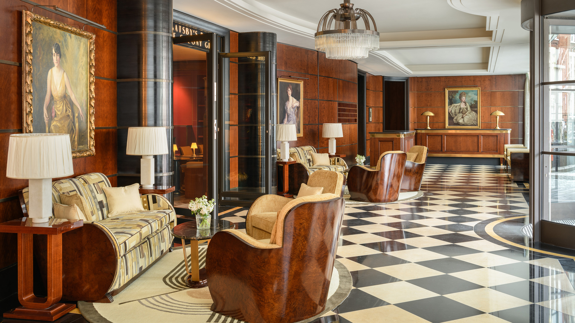
Minimal interfaces transform imagery into narrative anchors. Cliveden House presents visuals with generous scale and limited repetition. Photographs appear deliberately, allowing light, texture, and proportion to communicate atmosphere. The site avoids saturation, giving each image time and weight. Guests engage emotionally because the interface respects attention. Visual silence amplifies meaning, turning images into moments rather than background elements.
Visual silence as a navigation tool
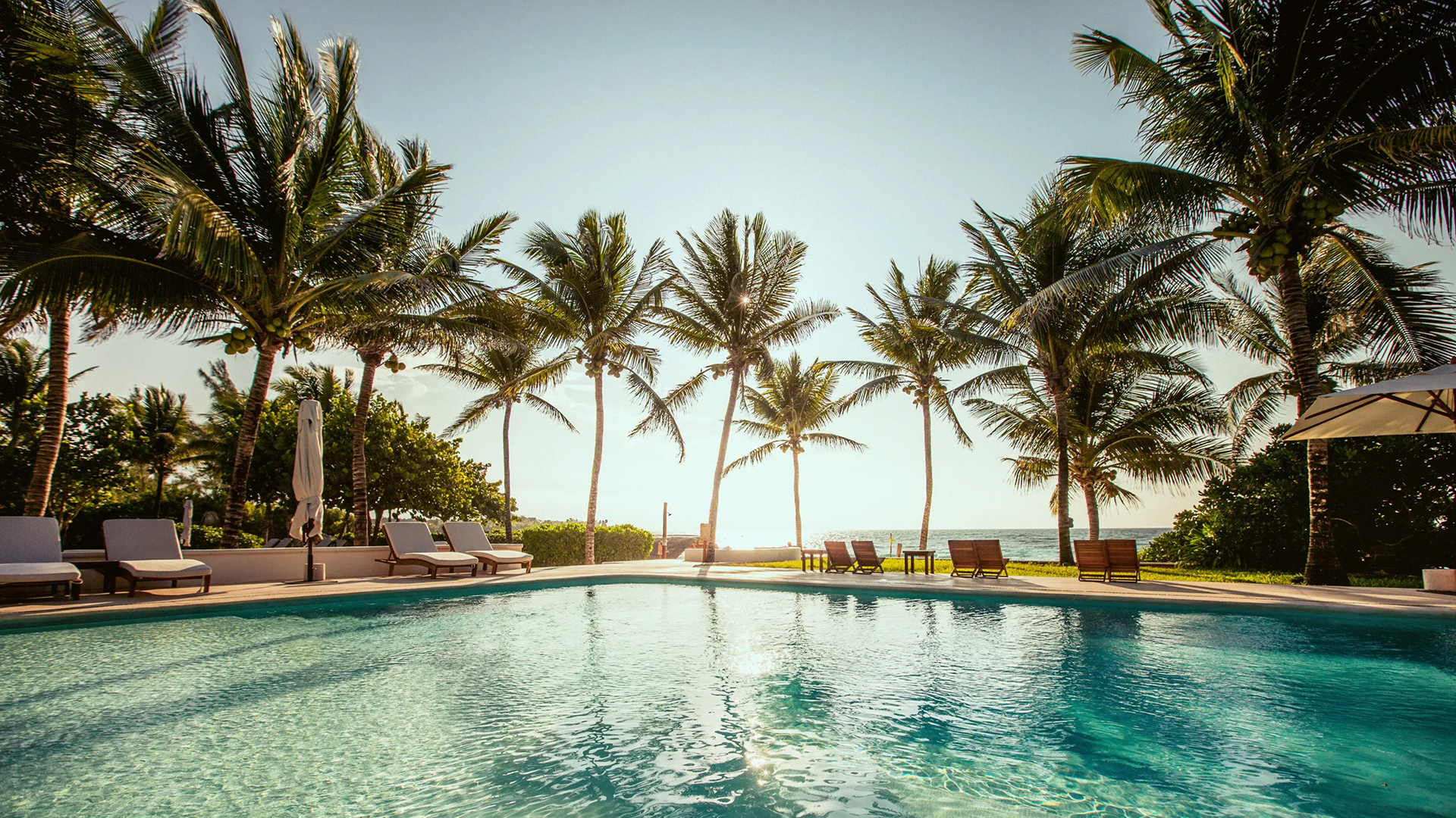
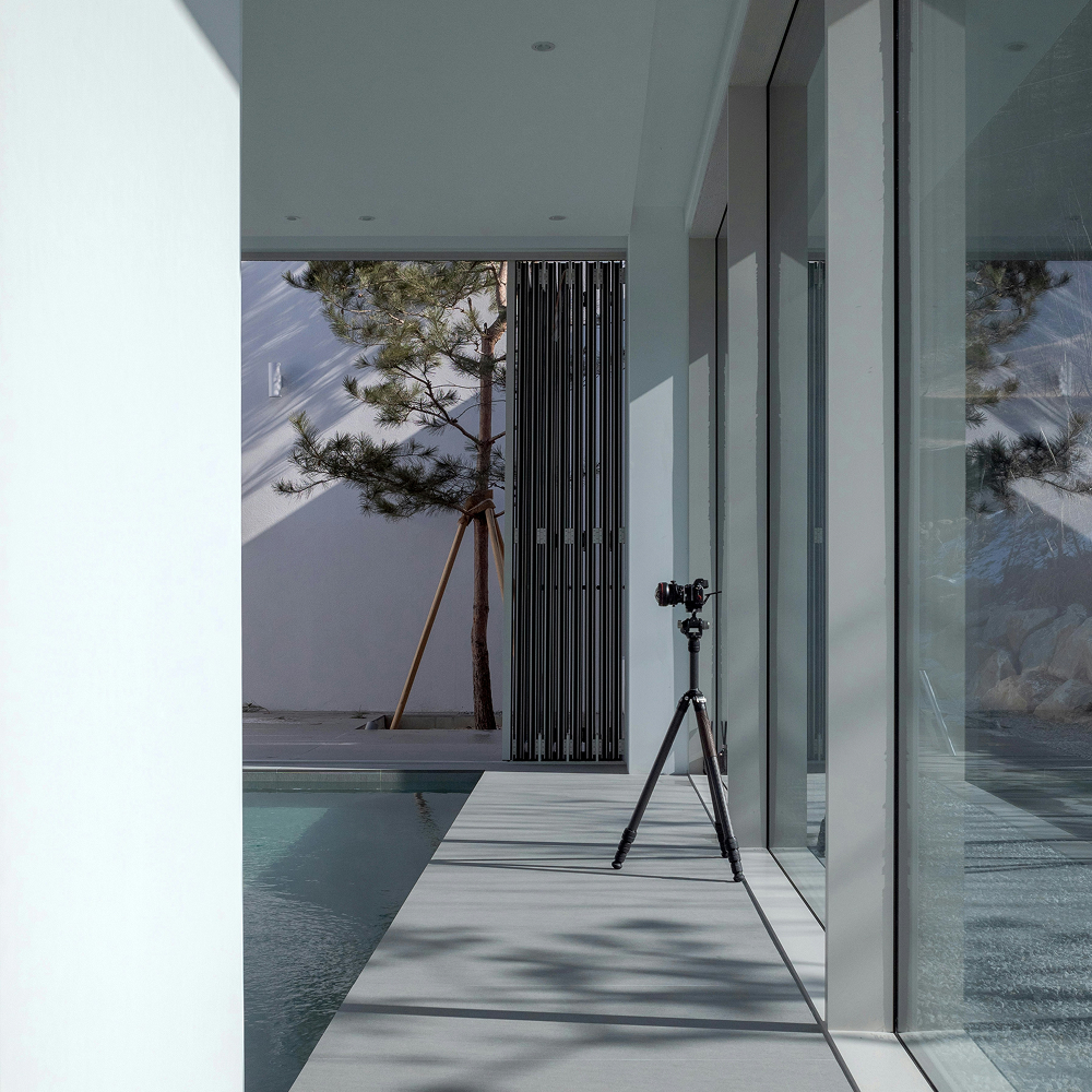
A restrained interface supports orientation and ease. Clear pathways reduce cognitive load and improve comprehension. Hotel Esencia structures its website around a small number of intuitive sections. Navigation follows a natural sequence aligned with guest intent. Choices remain limited and legible. Guests move through the site with confidence because the interface anticipates decision making. Visual silence becomes guidance, helping users focus on what matters at each step.
Typography as a service element
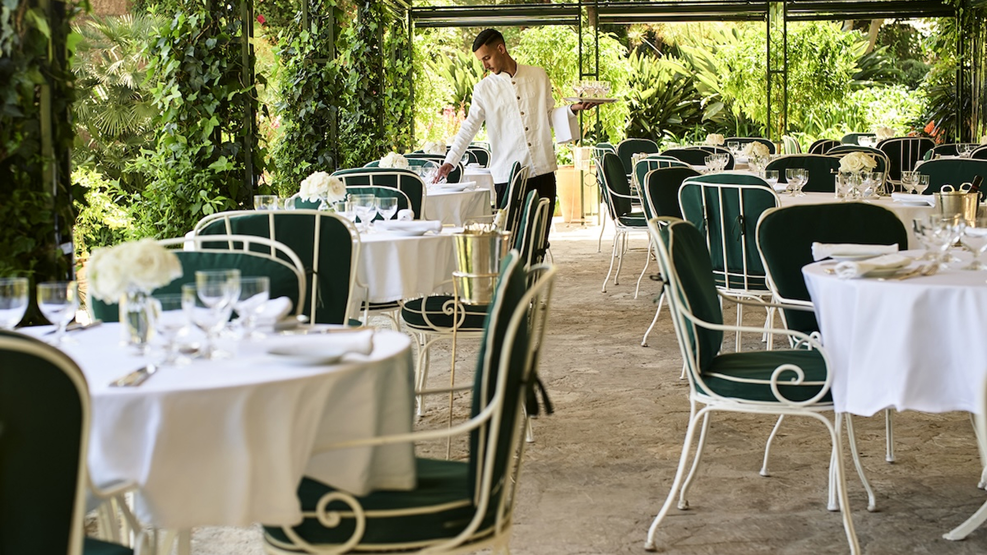
Typography gains strength through space and consistency. Borgo Santo Pietro applies readable fonts, generous line spacing, and clear hierarchy across its digital touchpoints. Text feels calm and approachable. Information flows naturally, supporting understanding without interruption. Guests absorb content easily, reinforcing the perception of care and professionalism. Typography acts as an invisible service layer, shaping comfort through clarity.
Fewer elements, deeper understanding
Interfaces with reduced visual density support stronger comprehension. Research from the Nielsen Norman Group shows that users retain information more effectively on pages with limited visual clutter. Premium hospitality websites that apply this principle benefit from longer engagement and smoother navigation. Visual restraint lowers cognitive effort, allowing guests to focus on meaning and intention. Understanding emerges from simplicity, and trust follows clarity.

Minimalism as the language of modern digital luxury
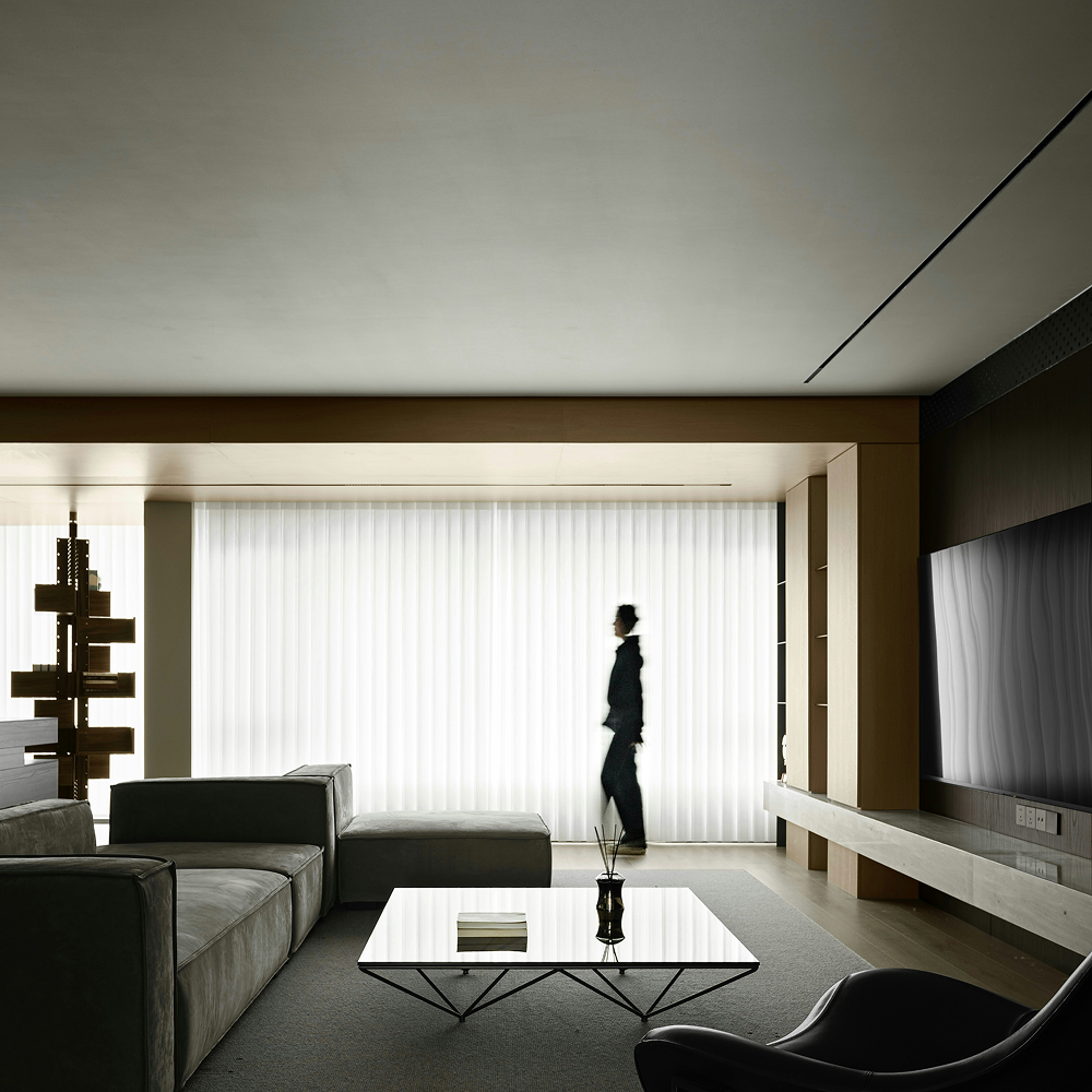
Luxury online now depends on discernment rather than abundance. Raffles London at The OWO demonstrates this maturity through stable layouts, measured animation, and limited calls to action. Each page serves a clear purpose. The interface feels composed and intentional, reflecting confidence in the brand's identity. Guests associate this calm digital environment with reliability and excellence.
Visual restraint communicates respect for attention. It shows that the brand values clarity over spectacle and meaning over accumulation. Digital luxury emerges when selection replaces excess and silence supports understanding. Epikure helps premium hotels design digital experiences where every element earns its place and expresses authority through balance. Contact us to shape interfaces that communicate value with precision and calm.