

A property’s digital presence should do more than inform. It should express the essence of the stay and build immediate confidence. Aligning copy, visuals and architecture with what guests actually experience is the foundation of higher conversion.
When the architecture of a website reflects how the stay unfolds in real life, guests feel immediately oriented. Each section becomes a bridge between anticipation and experience. A homepage that mirrors your property’s mood sets the tone from the first second. Subpages that follow the logic of a guest’s journey, from discovering rooms to exploring dining and considering experiences, improve both flow and clarity. For instance, the Aman websites separate content into elegant and intuitive sections that avoid distraction. Their layouts are calm, generous in spacing and strictly limited in call-to-actions. This reflects the pace and refinement of the actual stay.
Trust grows when the messages across your pages deliver the same story. If your homepage evokes serenity and warmth, then each subpage should reinforce this tone. A refined identity needs aligned vocabulary, consistent tone and photography that respects your light, textures and rhythm. Each page should deepen the promise made initially. A room page, a spa offer or a dining overview should never feel like separate experiences. This continuity supports intuitive reading and builds confidence with every click.
Every page has a role in guest decision-making. A room page should explain more than bed types or surface. It should express how the room contributes to the entire experience. A spa page should offer more than a list of treatments. It should reflect intention, pace and rituals. On Chablé Yucatán’s website, each page links sensory elements to cultural depth, which reinforces their positioning around holistic wellness. Clear copy, simple headers and restrained visuals help the reader stay focused. Less distraction. More direction.

Your hotel already holds a defined aesthetic, even if not yet formalised. The textures of your materials, the pace of your service, the voice of your team all form a coherent identity that should extend into digital. The website’s language must borrow from this DNA. If your stay is slow and elegant, the copy should be measured and composed. If your space is raw and warm, the words should feel grounded. Avoid marketing gloss. Precision and simplicity are more persuasive than decorative language.
Copywriting should bring structure and intention. Each line should help the user decide faster and feel closer to the stay. Replace poetic phrasing with clean and useful information. Focus on what matters to the guest. A short sentence about your morning light, your garden rituals or your in-room silence carries more meaning than long promises about excellence. Monteverdi Tuscany does this well. Its copy is composed, honest and rooted in place. It helps the guest project themselves with ease.
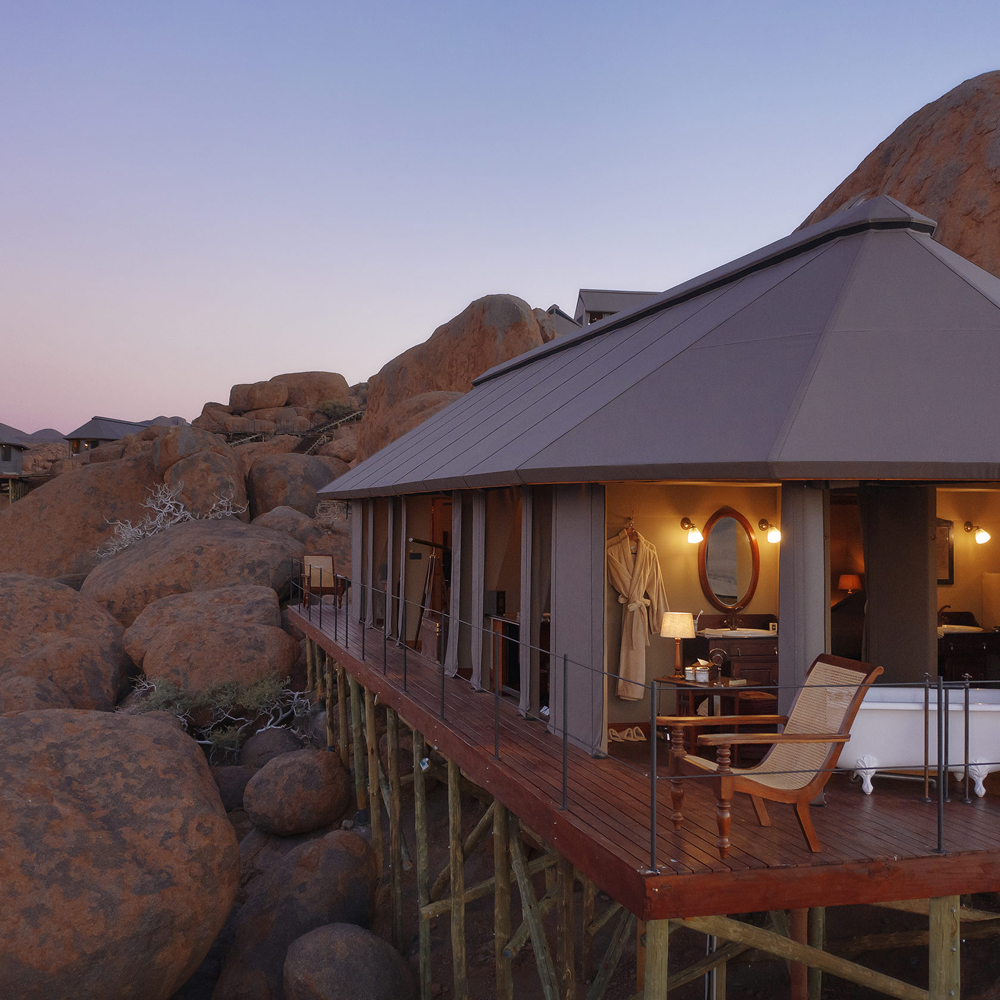
Photography should echo the atmosphere of the property and support the way your visitor reads. Galleries that show real light, natural textures and thoughtful composition help users feel immersed. Avoid overediting or placing too many images with no clear purpose. Each visual must serve a role in storytelling. A property like Zannier Hotels shows how to combine visual restraint with emotional precision. The result is focus, not confusion.

A high-performing website does not depend on motion, plugins or extensive features. It depends on clarity, emotional truth and trust. Each section must help the reader understand the value of your property and feel confident in their next step. Avoid generic UX patterns that feel too commercial or too removed from your tone. Instead, guide the user with the same clarity and calm you would offer them on site.
When every section feels aligned and sincere, the guest begins to trust what they see. That trust becomes the condition for a future booking. Avoid pressure tactics and heavy sales elements. Make pricing visible. Show availability transparently. Let the user make their decision in peace. The more your digital presence reflects your true stay, the more you will convert.
We work with hospitality leaders to align their site with the real experience of the stay. Our audits help you improve homepage clarity, room storytelling, spa positioning and experience design. We map out three actionable steps to improve consistency and trust. Reach out to review your key pages and make sure your messages convert.
