

When the booking journey feels unclear, motivation fades. Each unnecessary click, missing button, or confusing label adds hesitation. Clarity in the booking path builds trust, improves flow, and supports more direct reservations, whether for a stay, a table, or a wellness experience.
Even the best offer loses impact if the path to booking feels awkward. In high-end hospitality, guests expect calm, coherent navigation across all services. Whether on mobile or desktop, they should immediately understand where to click and what to expect next. Vague language, redundant links, or disjointed interfaces often cause drop-off at the last step.
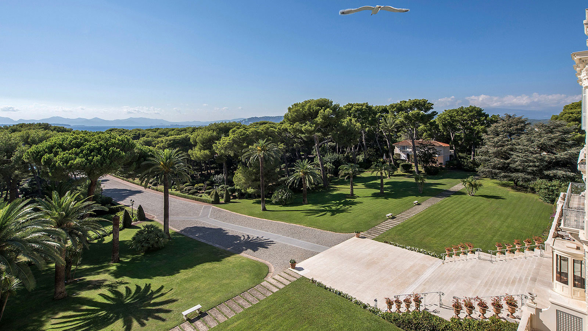
Rooms, restaurants, and spas follow different decision timelines. Stays are planned ahead. Dining is booked closer to arrival. Treatments often come last. Trying to combine these flows into a single funnel leads to confusion. Instead, each service needs its own clear path. At Terre Blanche, each booking action is isolated and clearly framed, with contextually placed buttons that reflect how guests plan and act.
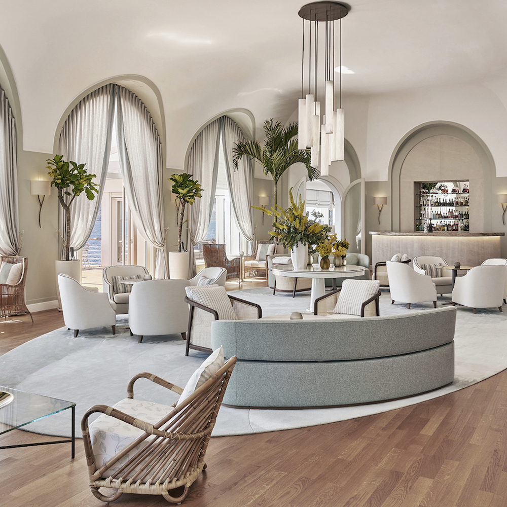
Adding more options does not improve clarity. In fact, duplicate calls to action in inconsistent locations often dilute focus. A single clear booking button, placed at the top and then again mid-scroll, works better than five disjointed prompts. At Hôtel du Cap-Eden-Roc, the flow stays minimalist and elegant. Buttons appear where they are expected, with language that reflects the tone of the brand.
Mixed vocabulary confuses the reader. One section reads “Check availability”, another “Book now”, and a third “Reserve your stay”. Inconsistency breaks the flow. Choose a single, clear formulation for each service and apply it across the site. Avoid dropdowns for spa menus. Let guests see time slots directly. For restaurants, focus on ease of access. Clean, aligned interfaces reduce drop-off and set the tone for the stay ahead.
Booking is a sequence of small decisions. Each click should reassure, not raise doubt. The role of the website is to answer questions before they arise, to guide without overwhelming, and to confirm the guest’s instinct that this is the right choice.
Availability is the first filter. Guests want to know whether their preferred room, table, or treatment is even an option. Hiding that information behind a form adds friction. Instead, show real-time calendars up front, and let pricing follow naturally. This simple shift removes ambiguity and speeds up the decision.
Redirecting to an external platform or launching a pop-up disrupts the booking rhythm. When possible, embed the booking engine into the page. The tool should match the tone, design, and pace of the site. Providers like D-EDGE or OpenTable allow seamless, branded integrations that support this consistency. Avoid unnecessary transitions and guide the user calmly through each step.
The end of the flow should not feel like a dead end. Confirm the next steps clearly. Will the guest receive an email? Is a deposit required? Can they modify later? Clear post-booking messaging reinforces confidence and reduces later service friction. Brands that script this moment carefully reduce inbound calls and improve pre-arrival satisfaction.
Booking flows do not need to be sophisticated. They need to feel right. Labels, buttons, links, order, all of it matters. A fast review can reveal friction points that have become invisible with time. If your booking journey deserves a fresh look, the Epikure team can help identify small adjustments with high impact. Reach out to book a clear, simple audit of your guest flows.
