

Before allocating any media budget, make sure your website is ready to convert. A well-designed booking path turns visitors into guests. A weak path wastes both traffic and trust. In hospitality, first impressions matter. And today, that first impression often happens online. A site that loads quickly, reads clearly, and guides with confidence sets the stage for better bookings. Paid campaigns should enhance a solid foundation, not cover for its flaws.
Every click you pay for comes with a cost. If a visitor lands on your site and cannot understand or act within seconds, the opportunity is lost. That friction is invisible on the media dashboard, but it shapes your entire performance. On luxury properties, where the decision to book involves a mix of emotion and reassurance, the online path must mirror the care offered on-site. Your booking engine, your visuals, your copy, and your flow need to help the user decide, not confuse them. This work comes before any ad goes live.
Most of your future guests will browse your site on a mobile device, often in conditions far from ideal. Poor signal, older phones, limited attention. A homepage that loads in five seconds or more leads to immediate drop-off. Each image should be compressed without losing detail. Text should remain readable without pinch-to-zoom. Buttons should be large enough to tap. Test your experience on real devices in real conditions, not only on a fast desktop connection. The websites of Borgo Santo Pietro and The Brando are good references: they combine full-screen visuals with minimal motion and efficient speed, even under low bandwidth.
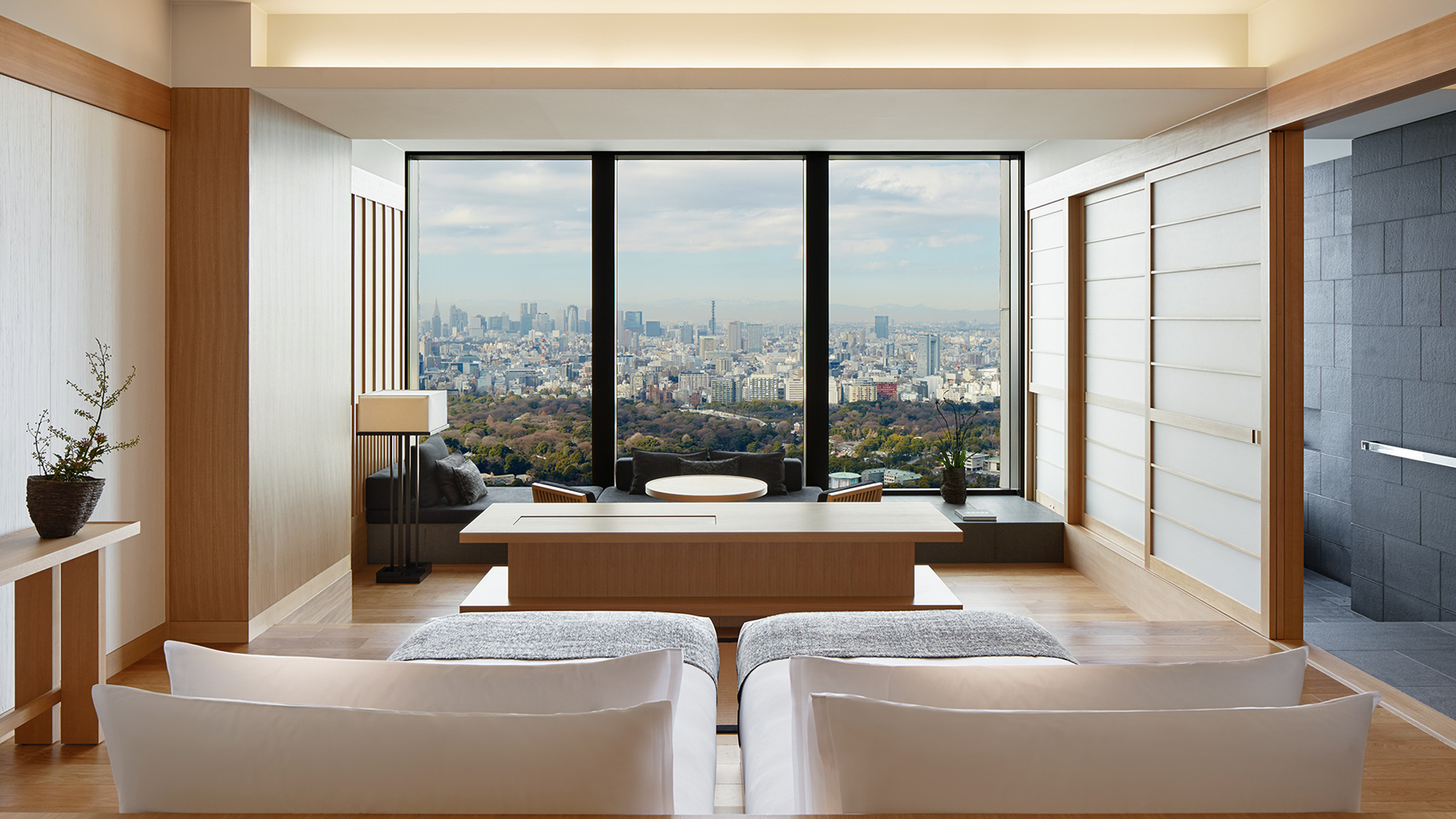
Your booking engine should never be hidden behind layers of content or buried in the footer. The user should see where to check availability and prices the moment they land. Keep the button visible, always. Avoid vague calls-to-action. Say exactly what the click leads to. “Book Your Stay,” “Check Rates,” or “See Availability” work better than “Explore” or “Learn More.” The Aman Tokyo homepage offers a clean interface where the booking path is visible without scrolling. Even with a calm and refined tone, the user knows exactly how to proceed. This balance is what you should aim for.
Visual polish is not enough. Visitors look for reassurance before they commit. This trust can be reinforced quietly. Avoid cluttered carousels of badges or intrusive pop-ups. Instead, highlight details that matter: updated photos, transparent cancellation policies, real reviews with a date and a name. Show that your content reflects the current state of the property. When key information is outdated, incomplete, or hidden, the entire site feels unreliable. Les Sources de Caudalie does this well: the visuals, descriptions, and pricing are all aligned with the property’s present offer. Each click reinforces the guest’s comfort.
Once the foundation is solid, paid media becomes a multiplier. But if core issues remain, even the best-performing ad will lead to frustration. A site that isn’t ready turns attention into hesitation. Campaigns should come after you've corrected load speed, booking visibility, content alignment, and mobile UX. Not before. Once these pillars are in place, you can build more advanced strategies with better results and clearer data.
Every campaign should have a clear endpoint. You need to know exactly what happens between the moment someone sees your ad and the moment they complete a booking. Identify where they land, what they see first, how many actions they take, and where they hesitate. If the ad promises flexibility but the page they land on mentions nothing about change policies, that disconnect costs conversions. If a user comes from an Instagram story and lands on a page that takes four seconds to load, they’ll close it. Use tools like Hotjar or session recordings to spot breaks in the sequence and refine accordingly.


Generic landing pages reduce the efficiency of your spend. Every ad needs its own dedicated experience. A Facebook carousel about your wellness retreat should not send users to the homepage. It should bring them to a page with spa availability, treatment details, and real images of the spaces they saw in the ad. La Réserve Paris structures its campaigns around clear and matching pages. Their “Suites & Offers” section connects perfectly with their seasonal campaigns, creating a sense of continuity between message and action. This alignment reduces drop-off and improves confidence.
Once your site is ready, run small campaigns and observe more than click-through rates. Watch how far users scroll, whether they interact with the booking engine, and which sections lead to exits. This is where actual performance emerges. You don’t need to launch everything at once. Controlled bursts give you clarity. Adjust gradually and monitor how each improvement reduces cost per booking. A clean site path does not only convert better, it gives better data to inform the rest of your strategy.
Paid traffic has the power to fill your calendar. But only if your digital path helps the user move forward with ease. Before investing in acquisition, take a step back. Open your site on a phone. Try the booking path yourself. Read the key pages with fresh eyes. Most fixes take less time than a campaign. And they bring better results.
